10 Office Space Planning Metrics That Improve Utilization
Office space planning is a data-driven discipline that comprises a lot more than just floor plans. Without reliable data to inform policies, you risk overpaying for underused space or cramming teams into layouts that stifle collaboration.
If walking into an office where half the desks are empty, but every meeting room is booked solid sounds familiar, then you’re likely struggling to accurately capture the requirements of your team.
Here, we’ll go over the essential metrics that give workplace leaders a true understanding of how space is performing, as well as best practices for measuring, benchmarking, and applying these metrics in real right-sizing scenarios.
Take a quick look at the metrics that we’ll be covering below.
Let’s break down each of these metrics in detail.
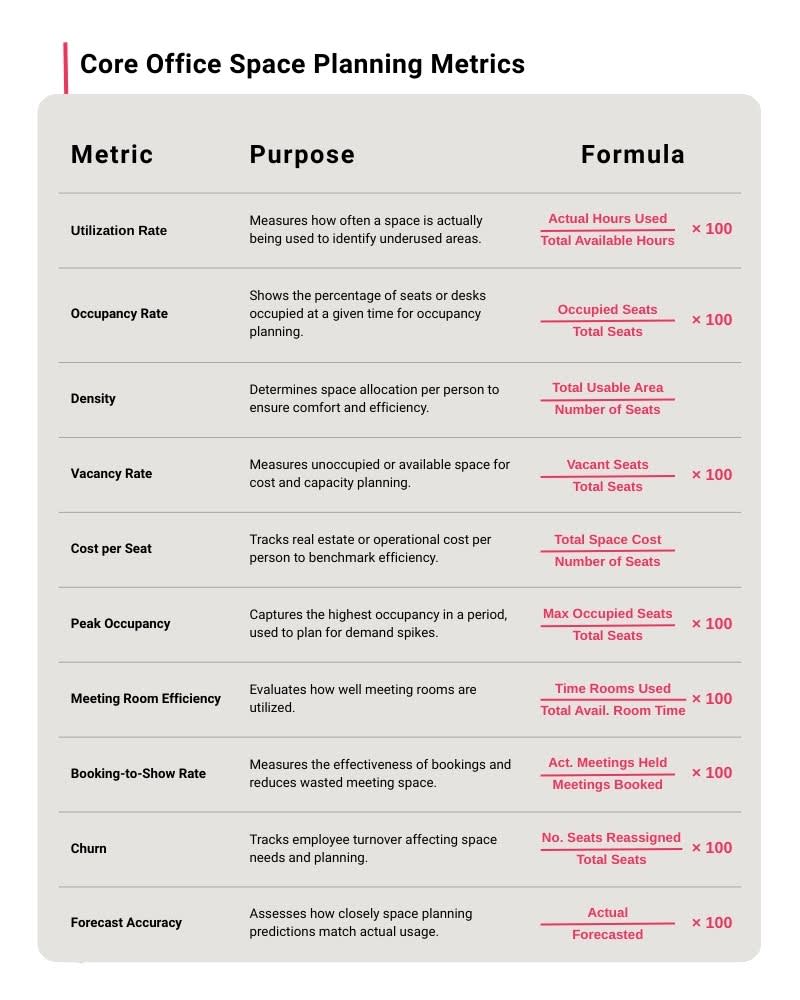
1. Space utilization rate
Space utilization rate measures how much of your available seating or room capacity is actually used over time.
Formula
Utilization rate is calculated as seat-hours divided by available seat-hours, or room-hours divided by available room-hours, and multiplied to provide a rate percentage.
Utilization Rate(%) = (Actual Hours used ÷ Total Available Hours) × 100
Benchmarks
For hybrid offices, average utilization typically falls around 60%.
How to apply the metric
Track space usage using seat booking data to calculate weekly average utilization. By understanding which areas are consistently busy and which are underused, you can optimize space allocation and adjust scheduling to quickly improve everyday employee experience.
Best practices
To make utilization data actionable, focus on planning for typical peak days rather than absolute maximum capacity. It’s important to accommodate busy days, like anchor days when most teams are in the office, without overbuilding for rare extremes.
Accurate utilization measurement starts with precise data. Using a digital twin to automatically capture floor plans and Instant Layouts provides a reliable baseline for utilization calculations.
2. Occupancy rate
Occupancy rate measures how many people are physically present in a space compared to its total capacity. Unlike utilization, which measures time-based use, occupancy is a headcount snapshot.
Formula
Occupancy rate is calculated by dividing the number of people present by the total capacity of the area, then converting to a percentage.
Occupancy Rate(%) = (Occupied Seats ÷ Total Seats) × 100
Benchmarks
Occupancy benchmarks vary widely based on work model and office type, but general targets include:
Hybrid offices: Average occupancy of 30–50% with peak occupancy typically below 70%.
Activity-based or neighborhood seating environments: Average occupancy of 40–60% with peak occupancy ideally below 75–80%.
Traditional assigned-seat offices: Average occupancy of 55–70% with peak occupancy below 85%.
These ranges help ensure the workplace remains comfortable, code-compliant, and capable of supporting spontaneous collaboration.
How to apply the metric
Occupancy data helps reveal how often spaces hit comfort or safety limits and whether adjustments are needed to meet employee expectations or, more crucially, compliance. For example, if peak occupancy in a department consistently reaches 80% or more, you may need to review egress capacity or redistribute teams to avoid circulation bottlenecks, overuse of shared amenities.
Best practices
Make sure to validate safety capacity by comparing peak occupancy (below) against local occupant-load factors and egress requirements so your layouts meet code and maintain safe evacuation routes.
Mapping occupancy data streams (e.g. sensors, Wi-Fi, and badge swipes) onto a digital twin helps visualize real crowding patterns. Pre-built integrations and APIs make data consolidation seamless. Hot-spot overlays can confirm where peaks occur and assess circulation flow before creating policy changes that improve comfort and safety.
3. Density (ft²/m² per seat)
Density measures how much usable space is allocated per seat. It provides a clear view of how tightly or comfortably people are arranged within a workspace. Balancing density thoughtfully supports both employee experience and regulatory compliance.
Formula
Density is calculated by dividing the total usable area by the number of seats and is typically expressed as square feet or square meters per seat.
Density(%) = Total Usable Area ÷ Total Seats
Some other related indicators also help contextualize how your workforce actually uses the space:
Employee-to-Desk Ratio = Total Usable Area ÷ Number of Seats
Mobility Ratio = (Mobile or Unassigned Employees ÷ Total Employees) × 100
Benchmarks Target density varies by industry, team type, and workstyle:
Focus-heavy teams (engineering, finance, legal): 150–225 sq ft per seat (14–21 m²).
Balanced teams (general corporate, hybrid knowledge work): 125–175 sq ft per seat (12–16 m²).
Collaboration-heavy teams (sales, design, product, marketing): 100–150 sq ft per seat (9–14 m²).
Lower densities may work for highly mobile teams with strong remote adoption, while more space is typically needed for focused, heads-down work.
How to apply the metric
Density is a helpful metric to use when looking for opportunities to boost overall employee satisfaction without requiring additional square footage. For example, reclaim excess density by converting a portion of open space into phone booths or small huddle rooms. This will absorb noise and increase privacy.
On the other hand, if you find that density is too high, consider redistributing teams or shifting to shared-desk models to relieve pressure.
Best practices
Use the density metric alongside utilization and occupancy so you can understand not just how much space each seat consumes, but how often those seats are actually in use. Reassess density whenever teams grow, shrink, or shift their workstyle, as even small organizational changes can quickly make existing layouts inefficient.
When testing alternative layouts, rely on fresh measurements rather than legacy plans. Matterport’s Automated Measuring and Schematic Floor Plans provide detailed resources for assessing density. You can also automatically defurnish the office space to use as a base for experimenting with new seating arrangements.
4. Vacancy rate
Vacancy rate measures how many seats are unoccupied relative to the total available. It provides both a desk-level view of how much capacity is sitting idle on a typical day.
Formula
Vacancy rate is calculated by dividing the number of empty seats or rooms by the total count, then converting to a percentage.
Vacancy Rate(%) = (Vacant Seats ÷ Total Seats) × 100
Benchmarks
Ranges for vacancy should be interpreted based on your intent, but some signals to look for are:
Healthy buffer (10–20%): Supports hybrid variability, provides choice seating, and prevents overcrowding on peak days.
Watch zone (20–30%): May indicate inefficiencies or misalignment between seating supply and actual demand.
Consolidation territory (30%+ sustained): Often signals excess capacity—especially when paired with low peak-day overcapacity or declining utilization.
The key is comparing vacancy to peak occupancy. High vacancy and low peak congestion typically point to true surplus space.
How to apply the metric
Vacancy analysis highlights opportunities to streamline your footprint or repurpose space. Examples include:
Identifying floors or blocks that can be partially or fully closed.
Shifting low-demand areas to flexible seating models.
Converting unused rooms into alternative spaces such as focus rooms, collaboration pods, or amenity zones.
Best practices
Vacancy becomes most actionable when paired with peak-day metrics. Sustained vacancy combined with low peak overcapacity is a strong indicator that consolidation may be appropriate, whether that means reducing the number of desks, closing a section of a floor, or reassigning a team to a smaller footprint.
Revealing where vacancy is structural rather than episodic can highlight opportunities for larger CRE portfolios to merge spaces and reduce cost significantly. Vacancy patterns are easiest to spot when every site is measured consistently. Using digital twins across your locations will give teams a comparable, visual baseline and help to identify patterns that aren’t obvious from spreadsheets alone.
5. Cost per seat
Cost per seat measures how much it costs to provide a single active workstation within your portfolio.
Formula
At its simplest, cost per seat is calculated by dividing total occupancy cost by the number of active seats.
Cost per seat = Total Space Cost ÷ Number of Seats
You can also break the metric down into supporting views for additional context:
Cost per sq ft/m²: Total occupancy cost ÷ usable area
Energy per occupied hour: Total energy cost ÷ total occupied hours (from sensors, Wi-Fi, or booking data)
Benchmarks
Costs vary widely by market, so it’s important to do your own research. These broad annual ranges will help to frame expectations:
Tier 1 urban markets: $10,000–$18,000 per seat.
Tier 2 cities: $6,000–$10,000 per seat.
Suburban offices or satellite hubs: $4,000–$7,000 per seat.
Industry mix, energy intensity, and service levels can shift these ranges, but the comparison between portfolio sites is what matters most.
How to apply the metric
Cost per seat is especially valuable for lease renewals and retrofit prioritization. For example:
Consolidation: If two adjacent floors each have high vacancy and low peak utilization, consolidating them onto a single floor may reduce cost per seat significantly through rent, utilities, and services savings.
Increasing desk sharing: If cost per seat is high due to underused dedicated desks, increasing desk-sharing ratios can lower the metric without reducing total square footage.
Best practices
Segment costs by driver—rent, energy, services, capital depreciation—so you can target the levers that will produce meaningful savings. For example, improving space efficiency may reduce rent over time, while right-sizing cleaning or security contracts will deliver short-term operational gains.
Considering purpose will also help to distinguish between truly inefficient sites and spaces that are simply serving a different purpose (e.g. collaboration hubs vs. focus-heavy offices).
When you assess strategic options like consolidation or retrofits, make sure to pair cost modeling with spatial context to ensure that you don’t simply shift the cost elsewhere. Digital twins provide a consistent base model to validate that proposed reductions or reconfigurations will maintain standards, and reduce the risk of expensive remodels.
6. Peak occupancy
Peak occupancy measures the highest number of people present in a space during a given period and helps understand when the workplace is under the greatest operational strain.
Formula
Peak occupancy can be calculated by identifying the maximum of regular occupancy readings over a defined period (Max Occupied Seats) and then applying the standard occupancy rate calculation to this number.
Peak Occupancy(%) = (Max Occupied Seats ÷ Total Seats) × 100
Benchmarks Many offices begin to experience queues, slowdowns, or service delays once peak occupancy exceeds 80% of available seats. Above this level, circulation bottlenecks and competition for unassigned seats also increase sharply.
How to apply the metric
Use peak occupancy to determine whether the office can comfortably support its population. Peak occupancy data is especially valuable when planning for anchor day congestion, to keep a smooth flow of services such as:
Security
Cafés & dining
Reception coverage
Elevator scheduling
Meeting room turnover
Amenities
If a department hits peak loads every Tuesday and Wednesday, for example, facilities teams can align food service, security staffing, and cleaning schedules to match these conditions.
Best practices
Always right-size for common peaks, not extreme spikes. There are a number of operational strategies you can put into place to help manage uncommon spikes that may occur due to one-time scenarios like company-wide events:
Encourage teams to adopt staggered start times (e.g. 8:30, 9:00, 9:30) or use soft incentives like early-bird café credits. This reduces immediate pressure on reception, elevators, and early meetings.
Pre-assign resources like additional staffing for days with surges.
Convert informal areas into temporary overflow zones. Lounges, project rooms, underused collaboration spaces can be used as hotdesk style seating during anchor days.
Notify teams of predicted high-traffic conditions and nudge them to arrive early for certain availability (e.g. meeting rooms or café access).
If you begin to find that compliance or comfort is at risk, document traffic to validate bottlenecks before making changes. Allow operational staff, like security or Health & Safety personnel, to tag areas in the digital twin where crowding issues occur (e.g. hallways, elevator lobbies, cafés, neighborhoods), so stakeholders can consider changes with context.
7. Meeting room efficiency
Meeting room utilization efficiency measures how effectively meeting spaces are used, helping organizations optimize room sizes, turnover, and overall availability.
Formula
A simple utilization calculation for each room or room category is:
Meeting Room Efficiency(%) = (Time Rooms Used ÷ Total Available Room Time) × 100
You can also analyze metrics by room size or type to identify misfits (e.g. 12-person rooms booked consistently by 2–3 people).
Benchmarks
Meeting room utilization benchmarks should be based on room size:
Small rooms: Target 50–70% utilization. These rooms are designed for short, frequent meetings or one-on-one discussions. This range indicates enough usage to justify the space without excessive turnover pressure.
Medium rooms: Target 60–75% utilization. These are typically used for small team meetings or project discussions. They are often more in demand than small rooms and can accommodate a wider range of meetings.
Large rooms (10–12p+): Target 40–50% utilization. Large rooms are intended for occasional team meetings, client presentations, or workshops: meetings that tend to occur less frequently.
Benchmarks vary with company culture, hybrid policies, and meeting norms, but the key is aligning room supply with actual team needs.
How to apply the metric
Use meeting room utilization data to identify both overused and underused spaces:
Overused rooms: Consider adding similar-size rooms nearby, adjusting time limits, or encouraging use of alternative spaces to relieve pressure.
Underused rooms: Evaluate whether idle rooms are oversized or poorly located. Options include downsizing, repurposing into smaller rooms or huddle spaces, or reallocating to open collaboration areas.
The right mix of small, medium, and large spaces will help to match actual demand while maintaining availability and comfort.
Best practices
Create and enforce policies that optimize meeting room usage and encourage responsible booking. For example:
Meeting time limits: Capping the duration of bookings prevents a few long meetings from monopolizing space.
Enforced check-ins: Requiring participants to check in at the start of a meeting ensures that rooms are actually being used.
Auto-release for no-shows: Automatically releasing rooms that are reserved but not used converts idle rooms into available resources quickly.
Communicate policies clearly in a shared resource. Embed your digital twin in a booking portal and use Notes to outline policies. This gives staff the full context they need to book responsibly.
8. Booking-to-show rate
Booking-to-show rate measures the percentage of scheduled meetings that actually occur, helping organizations identify “ghost meetings” where rooms are booked but never used. High rates indicate that rooms are being used as intended, while low rates suggest wasted capacity and false scarcity.
Formula
Booking-to-show rate is calculated simply by comparing how many meetings actually took place with the original number of bookings.
Booking-to-Show Rate(%) = (Actual Meetings Held ÷ Meetings Booked) × 100
Benchmarks
Organizations with strong booking discipline typically see 80–90% or higher attendance rates, especially when combined with enforced check-ins or reminder systems. Lower rates often indicate opportunities to reduce phantom bookings and improve overall room availability.
How to apply the metric
Analyzing booking-to-show rates helps to spot patterns of recurring no-shows or “ghost meeting” hotspots where rooms are frequently booked but empty. These create false scarcity, and should be prioritized for policy intervention or behavioral nudges.
Best practices
Often, poor booking behavior comes down to administrative error, rather than intent. Send alerts to meeting organizers and participants to confirm attendance or cancel if no longer needed, and make sure that staff have the right context to book an appropriate space for their needs.
Integrate digital twins into booking apps as a visual resource. With clear room layouts, capacities, and amenities at the time of booking, employees can quickly see which rooms fit their needs and make informed choices.
If demand is high for certain areas, set up recommended alternatives in meeting booking apps to prevent overcrowding in popular zones.
9. Churn
Churn measures how frequently seats are moved or reassigned within a workspace over a given period.
Formula
Churn is calculated by presenting the number of reassigned or moved seats as a percentage of the total seats.
Churn Rate(%) = (No. Seats Reassigned ÷ Total Seats) × 100
Churn is typically measured monthly or quarterly to capture short-term fluctuations and seasonal patterns.
Benchmarks Low churn of 1–3% per month indicates relatively stable layouts. 5%+ churn per month indicates a high level, but this might not be a cause for concern in fast-growing teams, project-based environments, or highly flexible spaces.
How to apply the metric
High churn signals frequent reconfigurations and may indicate a need for more modular layouts, neighborhood-style zones, or flexible furniture to reduce disruption.
Measuring churn helps justify the operational effort and cost associated with these changes, and reveals whether your office layout is adaptable enough to accommodate evolving business needs efficiently.
Best practices
Use churn as a leading indicator, combined with forecasted growth or project assignments to anticipate future seat-mix needs.
Though rapid or frequent updates may be necessary for some organizations (e.g. high-growth startups), they can be disruptive. Model reconfigurations quickly, using a digital twin as a digitally-accessible base reference, to minimize disruption in high-churn environments.
10. Utilization forecast accuracy
Utilization forecast accuracy measures how closely predicted space usage matches actual observed usage.
Formula
Forecast accuracy can be expressed as the error between forecasted and actual utilization or peak occupancy:
Forecast Accuracy(%) = (Actual ÷ Forecasted) × 100
Forecasts are typically generated using rolling averages to capture variability in occupancy patterns, seasonality, and special events.
Benchmarks
For most workplaces, acceptable forecast accuracy is generally within 85-90% for utilization. Error margins may be adjusted for seasonal fluctuations, holidays, or one-off events that affect office attendance.
How to apply the metric
Compare historical forecasts to actual utilization to identify where assumptions were off. For example, if last quarter’s forecast consistently underestimated peaks on anchor days, teams can adjust booking policies, expand swing space, or communicate more clearly about seat availability. Forecast accuracy also informs budget planning, particularly for error buffers in budgets.
Best practices
Accurate forecasts depend on precise baseline data. Ensure that all spatial inputs are consistent and reliable, to provide a true foundation for predictive models. Digital twins capture space measurements to a high degree of accuracy, ideal for planning and operations workflows. They can also be enriched with contextual data from multiple sources to centralize workplace analytics in one environment.
Use your office space planning metrics to drive workspace agility
Think of office space planning metrics not as static KPIs, but as dynamic levers for change-readiness and organizational resilience. Metrics like utilization, churn, and forecast accuracy don’t just measure the present; they reveal how flexibly your space can respond to new policies, hybrid schedules, or market shifts.
With Matterport’s precise spatial data as a foundation, teams can model alternative configurations, simulate occupancy shifts, and stress-test layouts virtually. This makes it possible to align corporate real estate strategy with workforce dynamics in real time, creating a workspace that is ready for whatever tomorrow brings.
Get in touch with our team